Pixel Perfect Purchasing :
E-commerce UI Reborn
Unveiling a cutting-edge redesign for old E-Commerce brand App. PChome 24h Shopping is a well-known electronic brand in Taiwan, but even after having an app for many years, it still suffered from low brand awareness and poor usability .This redesign has revolutionized user experience and enhanced customer satisfaction. The project has also established the Design Guideline for the first time.
Role
UI/UX Designer
Contributions
UI/UX Design
UXR
Project & Time
EC App
2 Month
Team
Project Manager
Dev Team
Link

About this App

PChome24h is a major Taiwanese e-commerce platform known for its fast delivery options. It offer over 5 million products, with over 2 million in stock for immediate delivery. And boast 24-hour delivery throughout Taiwan and even offer 6-hour delivery in Taipei City.
Background & Goal
" PChome 24h aims to expand new business opportunities, including targeting younger users, capturing opportunities among female consumers, and increasing sales in various product categories. It requires the formulation of specific development strategies to establish PChome's image as trustworthy and reliable, creating a distinct advantage over competitors. "
Discovery & Gather Feedback
Research Purpose
Comparing the user experience of other competing e-commerce platforms, understanding the strengths and weaknesses of PChome's competition.
Exploring the usage experience, processes, and pain points of PChome 24h's target audience as references for the platform's redesign direction.


How to Start
Base on where our user having issues, our team’s next step is to audit the pain point across every pages. You can't start a redesign without knowing a full picture. It is crucial to have a comprehensive understanding of the entire application. Therefore, we initiated the process by creating a sitemap as the first step. We divided the project into segments and proceeded to complete each part.


Screens
while maintaining a consistent design style across the website. The interface design is modernized to enhance browsing experience and facilitate future block optimization. Here is the Old Version v.s. New version.


Design Guideline
The color scheme of the app is revamped to optimize screen color contrast. The font size hierarchy is refined for improved clarity and readability, The Guideline define the whole style and basic layout .


regular
Medium
Bold
regular Italic
Bold Italic
Title 1
Title 2
Title 3
Body 1
Body 2
Body 3
Caption 1
Amount-L1
Amount-L2
Amount-M1
Amount-M2
Amount-S1
Amount-S2
Typography
Maintain consistency in the operating area to reduce complexity and prioritize intuitive operation. Re-layout the information considering its importance, reduce the sense of warning, and unify the prompt display specifications.


Enhanced Contrast Ratio to Complying WCAG

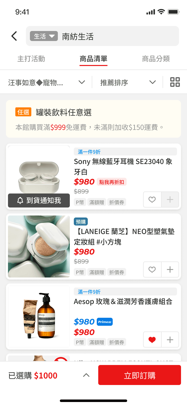


Throughout the process, valuable insights were gained from user feedback, usability testing, and data analysis. Users expressed frustration with the app's navigation and found certain features confusing. The project team identified key pain points and focused on improving the app's information architecture and visual design.
The next step involves implementing a more intuitive navigation system, simplifying the onboarding process, and incorporating interactive elements to enhance user engagement.
Additionally, personalized recommendations and a streamlined checkout process will be introduced to improve user satisfaction and retention. Continuous user testing and feedback loops will be established to ensure the redesign meets the users' needs and results in a seamless and delightful B2C app experience.