Invoice App
Invoice was a popular electronic invoice carrier app. It worked perfectly for saving digital receipts. My role was Lead Product Designer. Led a rebrand that repositioned the app from a transactional invoice tool into a proactive personal assistant.
Role
Lead
Product Designer
Contributions
UI/UX Design
UXR
Project & Time
App
8 Sprint
Team
PM
Marketing Team
Dev Team
Link

Background
In Taiwan, mobile barcode carriers let consumers auto-register e-invoices for lottery draws and tax deductions. Our app helped users manage this, but usage data told an uncomfortable story. Users opened the app almost exclusively around the bimonthly lottery announcement, then abandoned it. Session length averaged under 40 seconds, and weeks would pass with zero opens in between.
The product looked and behaved like a utility. Users opened it, checked one thing, and left, the same relationship people have with a calculator or a flashlight app. But the underlying value we could offer, spending insights, reminders, savings tracking, was something closer to what a personal assistant does. It was something people could check in with, not just check.
Challenge 💡
" Could repositioning the brand and experience, not just adding features, change how often and how long people engage? "

Strategy & Reframing Problem
Repositioning isn't a design-only decision, so I kicked off this phase jointly with Marketing. We agreed early on that any new positioning needed to be validated by both user behavior data and a clear picture of who our users actually were, not just a design intuition about what "feels friendlier."
Survey and AI-Driven Insight to understand who our users actually were
Before assuming what would make the app feel more personal, we ran a survey (n=930) covering age, job, and how people currently thought about e-invoices app. This mattered because "personal assistant" can mean different things to different segments. To efficiently process the open ended feedback, we leveraged an AI synthesis workflow to cluster responses into semantic themes. This analysis revealed a clear divide in user expectations. Utilizing AI to map these distinct personas ensured our personal assistant framework was built on validated behavior rather than intuition.

Working with Marketing
Marketing had run brand perception studies before, but always separately from product usage data. I paired their brand tracking questions with our behavioral analytics and ran a joint workshop to align on what "personal assistant" should even mean for this category (financial, tax-related, low daily relevance). This kept the repositioning grounded in something Marketing could carry through to messaging and app store copy, not just the UI.

We reframed the challenge from a UI problem into a relationship problem:
"Users don't return because the app has nothing to say to them between invoice events. To be worth returning to, it needs to behave less like a filing cabinet and more like someone looking out for you."
So, we evaluated two design approaches to see whether visual organization alone could fix our retention issue or if a deeper mental model shift was required.
[ Round 1 ] visual refresh only
The first iteration organized the home screen as a functional grid, quick-access icons each leading to its own isolated task flow. In testing, users could complete tasks quickly, but nothing on the screen gave them a reason to open the app outside of those specific tasks. Session behavior didn't change: sessions were still trigger-only, which confirmed the problem wasn't about layout clarity, it was about what the home screen was framed to be.
[ Round 2 ] behavioral repositioning
We restructured the home screen around a single, changing "assistant message" at the top (for example, "Higher invoice count than 90% of users this month"), replacing the tool list as the primary focus. In moderated testing, version 2 produced unprompted return visits during the testing window, something the tool-framed version never generated. Users described the experience as "it feels like it's paying attention," which validated the assistant framing.




Key design decisions
Replaced the tool list as the default view with a dynamic, personalized summary card
Introduced a lightweight "check-in" pattern: small, non-lottery moments worth opening the app for, such as spending trends, milestone badges, and donation impact
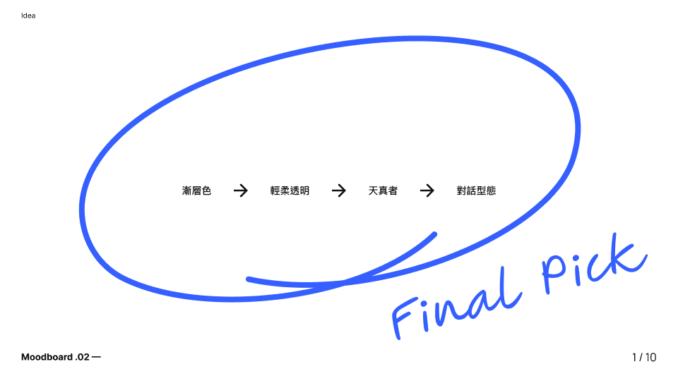
Softened the visual identity with rounder shapes and a dreamy palette to reinforce the tonal shift, but treated this as reinforcement rather than the fix itself
Visual Identity
To visually communicate this shift to a personal assistant we moved away from rigid geometry and cold corporate blues. The new logo features a dynamic spark icon that implies ongoing support and bright insights. We replaced the old color palette with a modern combination of deep indigo paired with warm peach and soft lavender. These colors feel much more human and conversational. We updated the typography to a clean sans serif font that looks highly legible on digital screens while feeling welcoming.


Digital Experience and UI Design
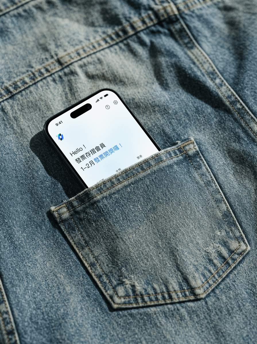
Home Screen: Leads with a personalized, first-person insight rather than a raw list, reframing the app as observant rather than archival.
Visual Identity: Updated palette, typography, and iconography to feel warmer and more human, consistent with an assistant rather than a filing system.
Personalized Home Screen Widgets: To encourage engagement beyond the core app experience, we designed customizable widgets for both iOS and Android. Users can tailor the displayed information to fit their unique style and daily needs.


Light Mode & Dark Mode


We designed complete light and dark themes to ensure the assistant looks beautiful at any time of day. Instead of using harsh pure black for the dark interface we utilized the brand deep indigo. This specific color decision kept the digital companion feeling and conversational even at night. In light mode the clean background allows the new insight cards to stand out clearly.We specifically crafted the dark mode using our deep indigo palette to provide a comfortable experience for users checking their finances late at night.
Results over an 4-week post-launch window
Average sessions per user: up from 2.4 to 3.3 sessions per week. This was the number most directly tied to our original problem: infrequent visits. A rise here meant users were coming back on their own initiative between lottery cycles, not just when prompted.
Widget interaction rate: among users who installed the home screen widget, 34% tapped into the app at least once per week through the widget, versus a much lower spontaneous open rate for users without it. This validated the widget specifically as a design decision. It gave the assistant relationship a presence outside the app itself, and it worked: widget users opened the app more often than non-widget users with otherwise similar usage patterns.
Project learnings & Next steps
The biggest lesson from this project was that a rebrand isn't a visual exercise. It's a relationship redesign. Early on, I underestimated how much of "feeling like a tool" was rooted in structure and language rather than color and iconography. The visual refresh alone moved sentiment but not behavior. Only when we changed what the app said and when it said it did usage patterns actually shift.
If I had more time, I'd want to test how far this positioning can be pushed. For example, whether more proactive financial suggestions start to feel less like an assistant and more like unwanted advice. Personal-assistant positioning has a ceiling, and I'd want to find it deliberately rather than discover it through user complaints.